Untar the package of sample data files on the class website named 'data.tar'. This will create a subdirectory named 'data' under the current directory. Change into that data subdirectory. Inspect the contents of the file 'damped_osc.dat' from the data file package and note the three columns of numerical data:
less damped_osc.dat
Now at the shell prompt, start an interactive gnuplot process:
gnuplot
Note the initial display from the gnuplot program, and the terminal prompt changing from the shell prompt to 'gnuplot>', indicating the gnuplot process is accepting terminal input. This will be the case until the 'quit' command is issued to gnuplot to terminate the process and return to the shell. Set the labels for the X and Y plot axes:
	set xlabel 'Time (seconds)'
	set ylabel 'Displacement (centimeters)'
For now, since we are generating one simple data plot, disable the display of the plot key:
unset key
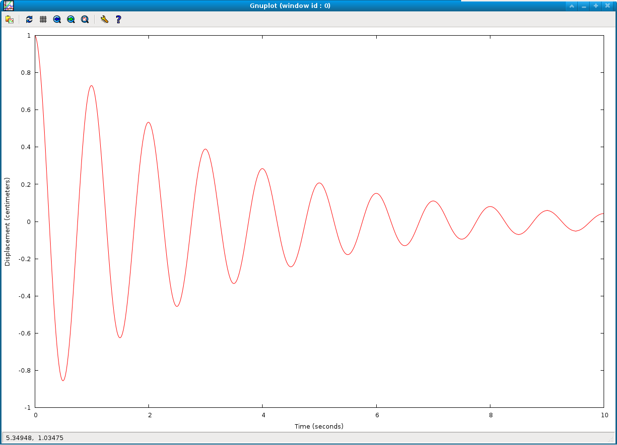
Now plot the displacement data in the file 'damped_osc.dat', using column 1 to supply the X coordinates and column 2 to supply the Y coordinates, connecting sequential data points with lines:
plot 'damped_osc.dat' using 1:2 with lines
You should see a new, separate graphics window created with this plot:
Try resizing the graphics window and clicking the 'replot' button on the top left of the graphics window.
gnuplot conveniently uses the same type of terminal interface that the bash shell uses, including the ability to recall previously issued commands with the up and down arrow keys, and edit them with the left and right arrow keys.
Now explore setting the ranges on the X and Y axes manually. By default gnuplot will automatically scale the axes to include all the data points, but this can be overridden if desired. Try zooming the plot out:
	set xrange [-2:12]
	set yrange [-1.2:1.2]
	replot
and zooming into a portion:
	set xrange [2:5]
	set yrange [-0.75:0.75]
	replot
The default automatic scaling of the axes may be restored by clicking the "autoscale" button on the graphics window. You may also use the right mouse button in the graphics window to zoom into an interesting region of the plot graphically.
Now we will add a second velocity data plot. First enable the plot key:
set key default
This will restore the plot key that shows a label for each of the plot curves so you can tell them apart. (The text for each plot label will be taken from the 'title' argument of the plot command below.) Next define an overall title for the entire plot:
set title 'Damped oscillation simulation'
Now generate the new plot, taking the amplitude data from column 2 and the velocity data from column 3 in the data file. First add a second label to the Y axis:
set ylabel 'Displacement (centimeters), Velocity (cm/sec)'
Then combine two curves on one plot with:
plot 'damped_osc.dat' using 1:2 with lines title 'Displacement', '' using 1:3 with lines title 'Velocity'
This should display a new plot in the graphics window that looks like:
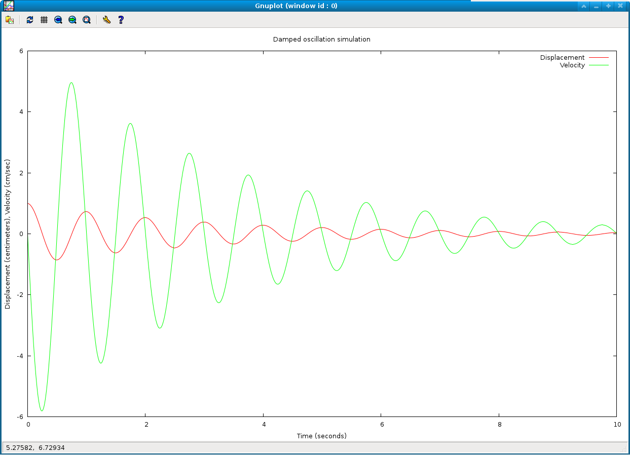
Note the key now appearing at the top right of the graphics window, with the label for each plot as given by the 'title' argument in the plot command. The overall plot title appears along the top edge. Also note that gnuplot saves you the need to retype the name of the data file over again by interpreting a blank file name '' as a repeat of the previous specified file name.
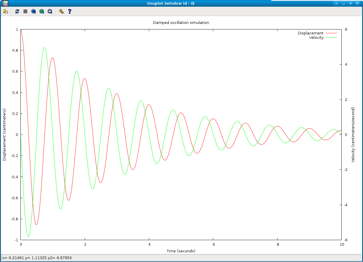
Note that by plotting two curves with somewhat different unit scaling against the same numerical Y axis, one curve can be compressed relative to the other, as gnuplot will scale the one axis to include both curves. To produce a more readable plot, You may refer each of the two curves to different Y axes with the defintitions:
	set ylabel 'Displacement (centimeters)'
	set y2label 'Velocity (centimeters/second)'
	set ytics border nomirror
	set y2tics border nomirror
	plot 'damped_osc.dat' using 1:2 with lines title 'Displacement', '' using 1:3 with lines axes x1y2 title 'Velocity'
Note the new 'axes' keyword in the plot command. This should produce a plot with separate left and right border Y axes, like:
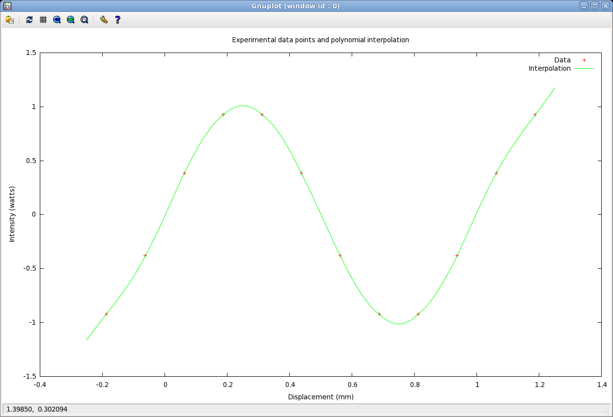
Now we will try mixing two different plotting modes, one as a continuous curve and the other as discrete data points. Assume the file 'exp_data.dat' contains individual experimental data points, and 'interpolation.dat' contains points for an interpolating polynomial passing through them. First reset to a single Y axis with:
	set ytics border mirror
	unset y2tics
	unset y2label
and then to generate the new plot enter:
	set title 'Experimental data points and polynomial interpolation'
	set xlabel 'Displacement (mm)'
	set ylabel 'Intensity (watts)'
	plot 'exp_data.dat' using 1:2 with points title 'Data', 'interpolation.dat' using 1:2 with lines title 'Interpolation'
Note the 'with' argument to the plot command is set to 'points' for the first data file and to 'lines' for the second file. This will generate a new plot with the two different plotting modes:
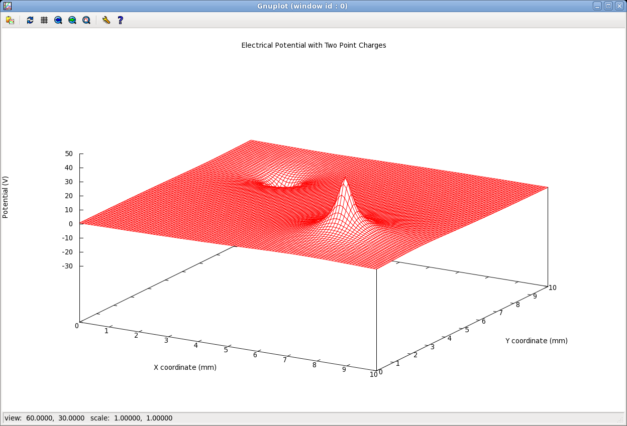
Finally we try generating three dimensional surface plots. Assume that the data file 'potential.dat' contains X, Y and Z coordinates in successive columns that describe an electrostatic potential profile in the presence of two point charges of opposite polarity. Try:
	unset key
	set title 'Electrical Potential with Two Point Charges'
	set xlabel 'X coordinate (mm)'
	set ylabel 'Y coordinate (mm)'
	set zlabel 'Potential (V)' rotate by 90
	set hidden3d
	splot 'potential.dat' using 1:2:3 with lines
You should see a surface plot in the graphics window like:
Play around with the viewing perspective by pressing the left mouse button and dragging the mouse around from side to side and up and down.